Bitnik Design System
The tokens and components that keep the site and bitnikgames' online games visually consistent — plain CSS, open source, ready to reuse in another project.
Extracted from this site's code in 2026 to keep the same visual identity between bitnikgames.vercel.app and the catalog's online games — without copy-pasting CSS between projects. Zero dependencies, no required build step: works in Astro, React, Vue, or plain HTML.
Install
Via npm (in a bundled project)
npm install git+https://github.com/dferreiramarques/bitnikgames-design-system.git@import "@bitnikgames/design-system/src/index.css";No npm (plain HTML, via jsDelivr)
<link rel="stylesheet" href="https://cdn.jsdelivr.net/gh/dferreiramarques/bitnikgames-design-system@main/src/index.css" />Load the fonts
<link href="https://fonts.googleapis.com/css2?family=Baloo+2:wght@500;600;700;800&family=Inter:wght@400;500;600;700&display=swap" rel="stylesheet" />The CSS only defines the stack (--font-display, --font-body) — the fonts themselves load separately.
Build a skin
The only layer you need to touch to adapt this to another brand is tokens.css — pick a palette and Google Fonts visually on this page, with a live preview using the package's real base.css and components.css, and export a new tokens.css.
Open the Skin Builder →Tokens
The only layer a "skin" should touch — change these variables and everything else follows.
Color
--color-yellow #e8a93b --color-yellow-deep #c4841f --color-orange #ea7c2e --color-orange-deep #c85f1d --color-brick #b8461f --color-brick-deep #8f3417 --color-cream #fbf3e4 --color-cream-soft #f3e4cb --color-cream-strong #ecd6ac --color-ink #2b1b12 --color-ink-soft #5b4636 --color-white #fffaf1 Shape (border-radius)
--radius-sm 8px --radius-md 14px --radius-lg 24px --radius-pill 999px Shadow
Derives from --shadow-color-rgb — change the skin's ink color and the shadow follows, instead of staying flat black.
Typography
--font-display · Baloo 2 Published games
--font-body · Inter Body copy, legible at any size — used in paragraphs, lists, and forms.
Base components
Layout, buttons, badges, and cards — what any marketing or catalog site needs.
Buttons
Badges
Shown here with this site's specific names (badge-free, badge-paid...). In the standalone package they're generalized to badge-accent / badge-primary / badge-secondary / badge-outline / badge-ink, to make sense outside a games context.
Cards
Bulbous
.card + .card-media + .card-body
Capivaras
.card-title + .card-excerpt
Catania
.card-meta + .card-footer
Optional layer: game UI
Not part of the default import — only import game-ui.css in projects with a board/cards. Extracted from the real games in the "Play Online" catalog.
Color chips
For referencing player/team/suit legibly — 4 color tokens (--game-color-1..4) that each game overrides with its own palette.
Game cards
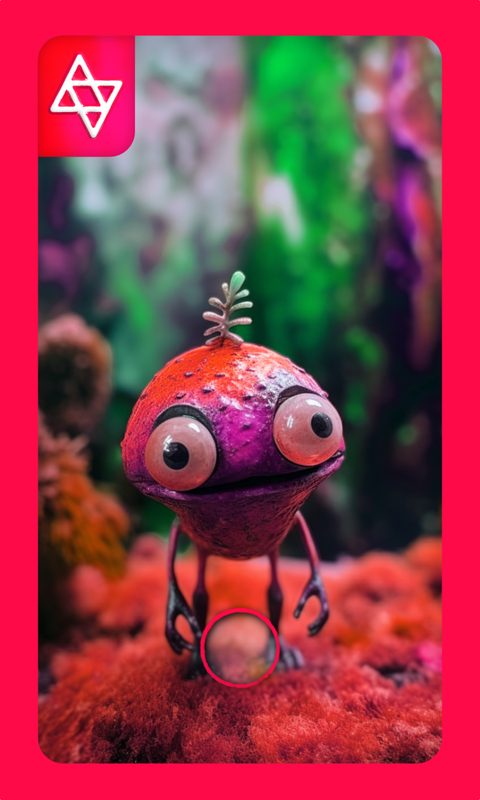 1
1 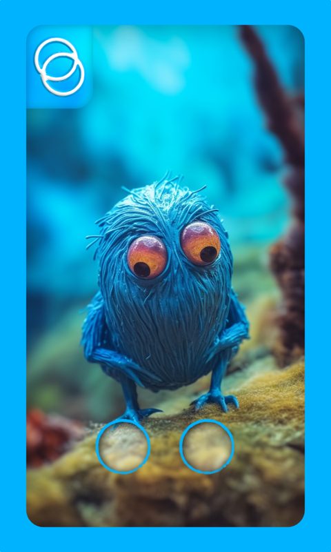 2
2 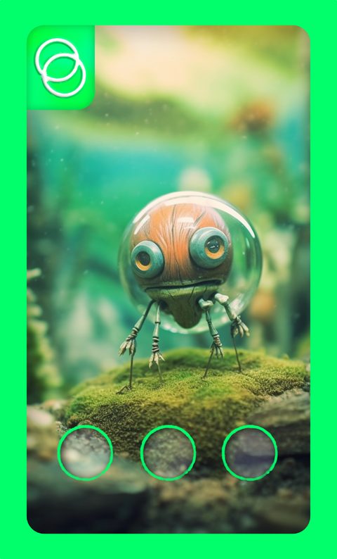 3
3 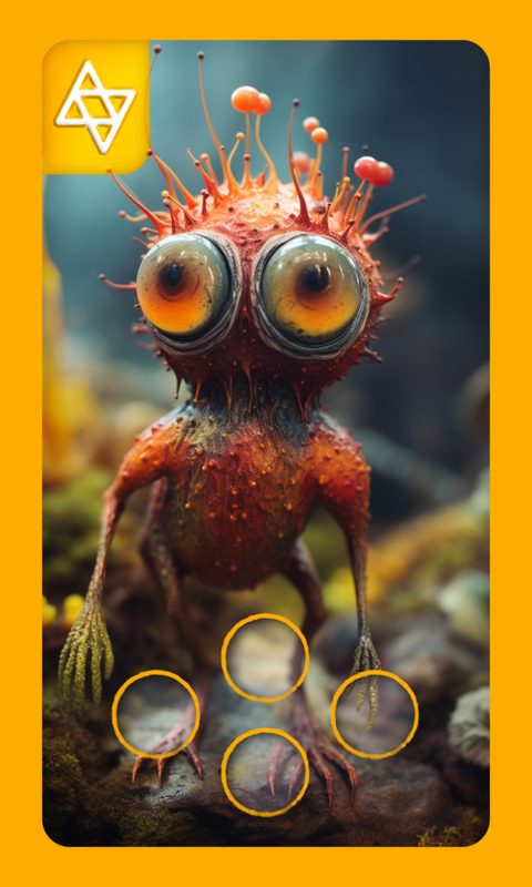 4
4 Real Bulbous artwork — hover to see the lift + shadow. .badge-circle overlays the numbering, .game-card-bar gives the bottom caption bar.
Dice
The same pip pattern (3×3 grid + --shadow-color-rgb) used for Nine Oils' 9 dice, frozen here on a sample roll.
Tabs
Toast
Confirm move?Modal
(shown outside the position:fixed overlay, just to see the box style)
This is .modal-box — used for card-detail popups and confirmations inside the games.
Games already using it
Each with its own palette — typography, radius, and shadow shared.
Bulbous
Dark theme, lilac accent. First to use .game-card, .chip, and .badge-circle.
Capivaras
Warm light theme, amber + teal. First to use --shadow-color-rgb correctly.
Catania
Gold-on-near-black theme. SVG text using var(--font-display) on the hex-grid map.